

Fanatics Leaked The Tennessee Titans’ New Logo On A Plush Toy, And It’s As Soulless As You Imagined [PHOTO]
This article was originally published on Total Pro Sports.
![Fanatics Leaked The Tennessee Titans' New Logo On A Plush Toy, And It’s As Soulless As You Imagined [PHOTO]](https://www.totalprosports.com/wp-content/uploads/2026/02/USATSI_24077833-1-1024x563.jpg)
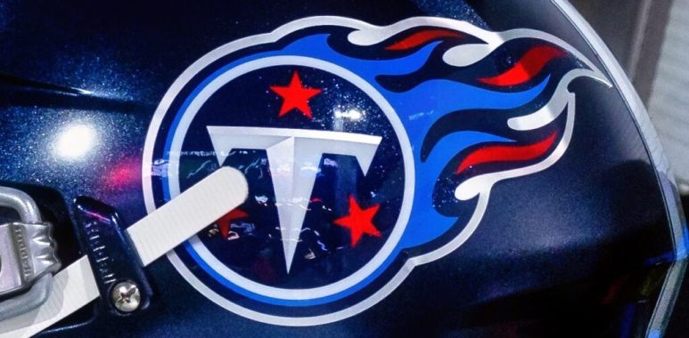
The Tennessee Titans may have taken a minimalist approach with their new logo, if Fanatics is to be believed.
Fanatics, the NFL’s official apparel partner, should be in the know where team emblems are concerned. And it appears they’ve leaked a fresh Titans logo ahead of the 2026 season.
What’s more, it’s come out on a $15 item: a Pegasus Player Pal Plush Ball.
New Tennessee Titans Logo Better Without The Flames?
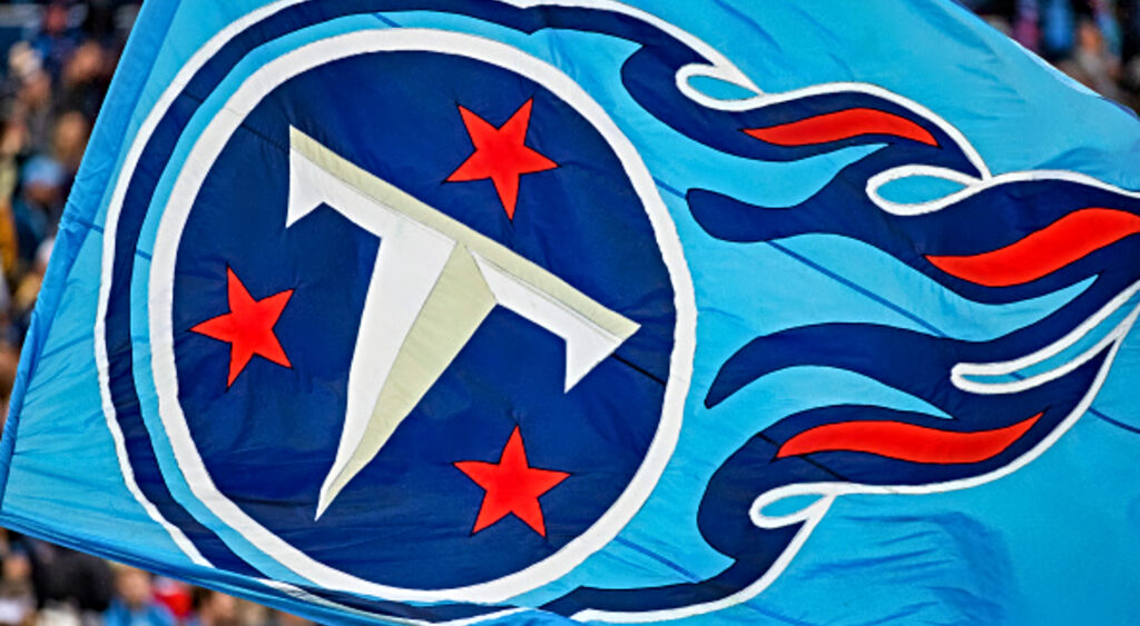
The new logo was described as “soulless” by a certain Twitter/X account, though many people disagreed in the comments.
You can check it out below and form your own opinion.
“Feel like I’ve seen it before,” someone claimed.
Feel like I’ve seen it before
— DaeQuil Jones (@dayquiljones2) February 14, 2026
“This is literally your logo without the childish flames and in better colors,” said a second.
This is literally your logo without the childish flames and in better colors.
— Free Howler (@fiftytwo8ty) February 14, 2026
“It’s not even bad. The flames were childish anyway,” added a third.
It’s not even bad. The flames were childish anyway.
— 👨🏾🦰 (@drewknox38) February 14, 2026
“I can’t tell if this logo is an upgrade or a downgrade,” someone wrote.
I can’t tell if this logo is an upgrade or a down grade
— Myk🐬 (@mauleani) February 14, 2026
“So much better than the early 2000s nascar flames lmao,” someone else laughed.
So much better than the early 2000s nascar flames lmao
— jax▪️▫️ (@jjaaxon) February 14, 2026
“Looks like someone extinguished the logo,” a user joked.
Looks like someone extinguished the logo
— ɴᴏʀᴛʜᴇᴀꜱᴛ 🇷🇼🇷🇸🇲🇦🇨🇳🇦🇿🇮🇱🇷🇺 (@ne172_) February 14, 2026
“It’s just really simple and taking the flames off. Nothing special. It’s just fine. Literally not the worst but not great,” one fan suggested.
It’s just really simple and taking the flames off. Nothing special. It’s just fine. Literally not the worst but not great
— CW (@CWest2K19) February 14, 2026
“If it had more red outlines it would look better. I think the idea was referencing the Houston Oilers look. Would love that if basically they just use that style. Oilers 80s-90s unis were awesome,” another comment read.
If it had more red outlines it would look better. I think the idea was referencing the Houston Oilers look. Would love that if basically they just use that style. Oilers 80s-90s unis were awesome
— Julia Pinkham (@Pinkham_Artemis) February 14, 2026
It appears fans thought the flames were too much. The team could score a few popularity points if they’re really getting rid of them.